UX/UI Design
Unifying the Product Experience
One product. Two platforms. Zero consistency — until now.
Year :
2024
Industry :
Education
Client :
SCHOOLVOICE
Role :
Lead UX/UI Designer
The Problem:
"A product that felt like two different apps"
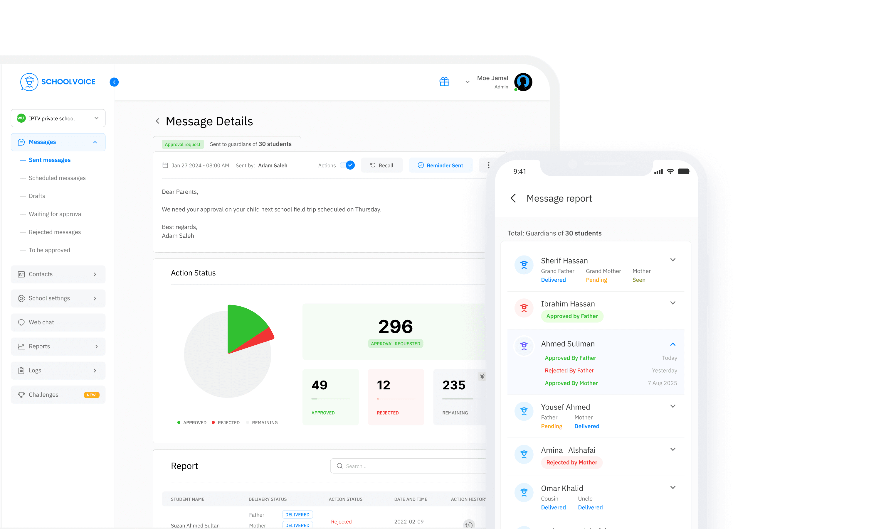
Schoolvoice runs across web and mobile, but for teachers navigating between both, the experience was anything but seamless. The disconnect wasn't cosmetic. It was structural.
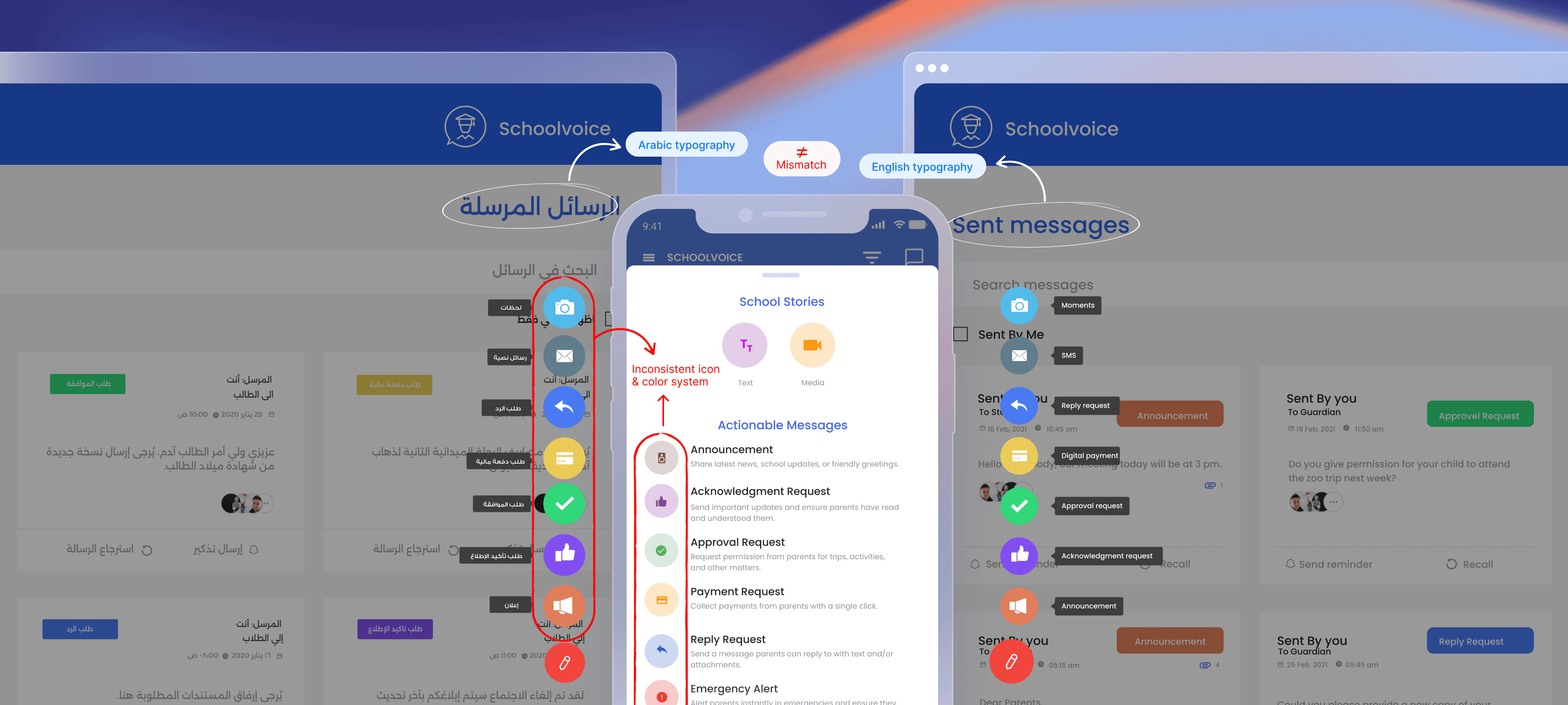
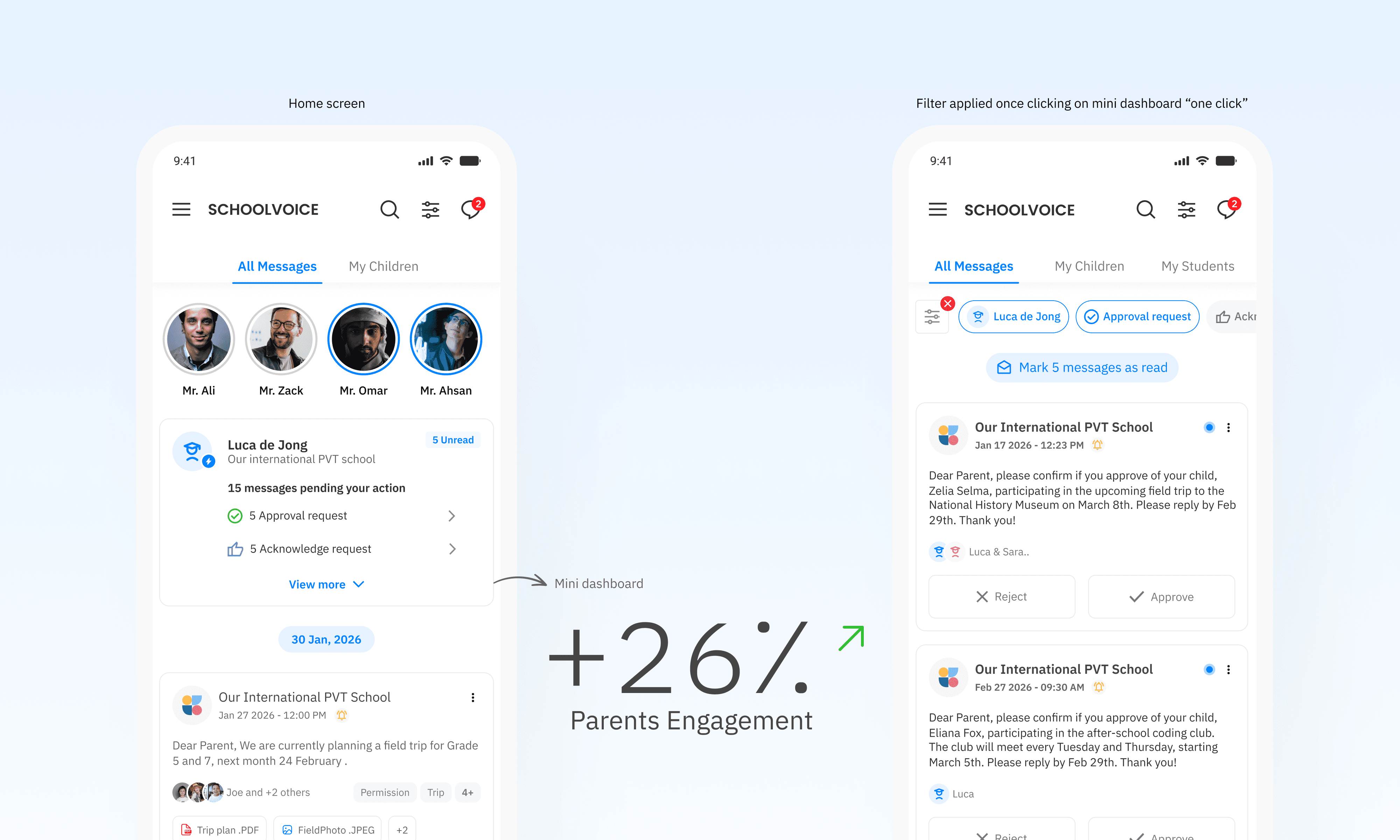
Arabic and English typography behaved differently across platforms: the Arabic typeface was oversized and visually heavy compared to its English counterpart, breaking reading rhythm and making bilingual interfaces feel unbalanced. Icons representing the same features carried different visual treatments depending on where you opened the app. Feature colors were inconsistent — the same action looked different on web versus mobile, eroding the mental model teachers built over time.
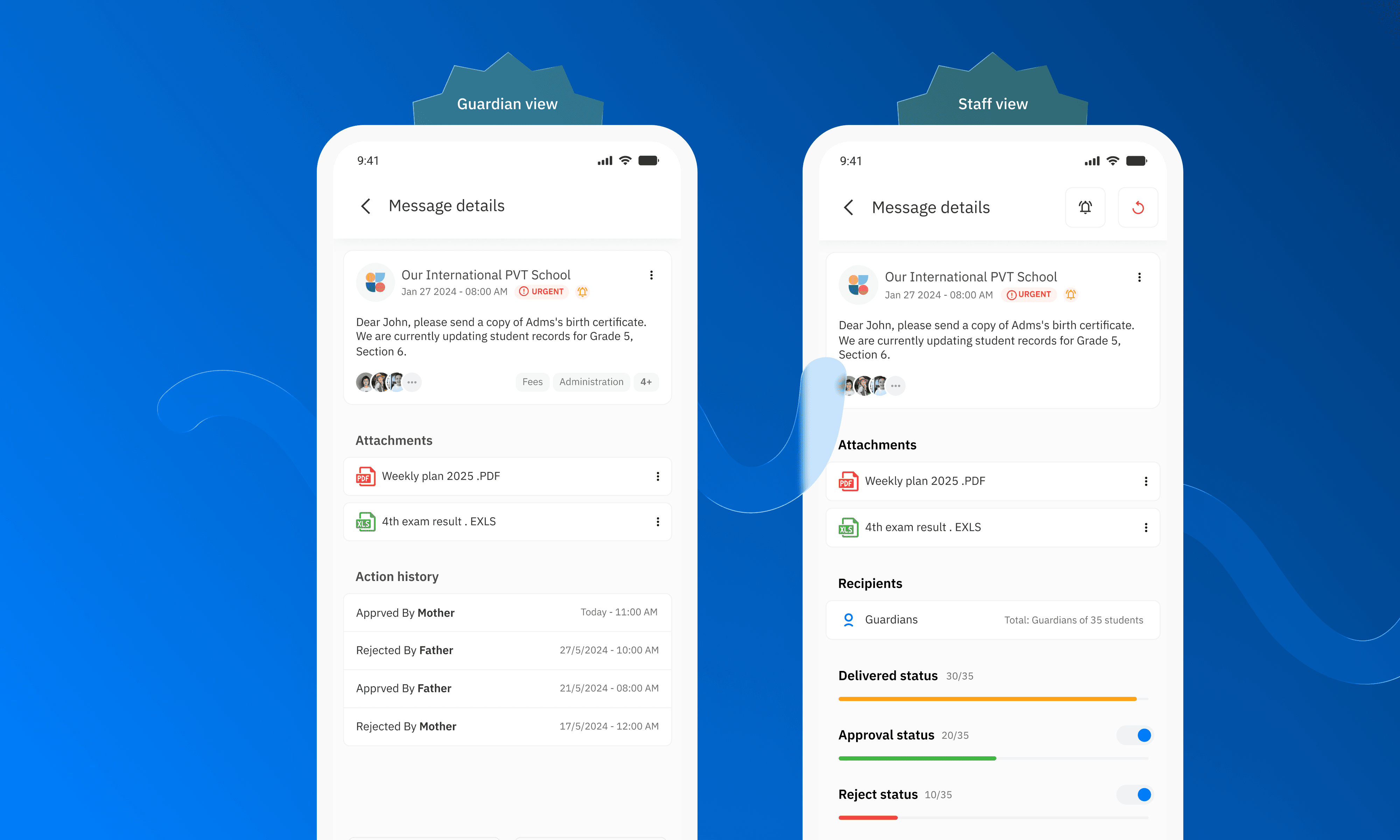
To make things more complex, key workflows — Sent Messages, Draft Messages, and Scheduled Messages — existed only on web. Teachers who started a task on mobile had no choice but to switch platforms mid-flow, creating friction at exactly the moments that required focus.
Without a shared visual language, every screen felt like a negotiation between two separate products.
Design Decisions:
"Building a design system from the ground up for two platforms and multiple brands"
The solution wasn't a visual refresh. It was an infrastructure problem that needed a systematic answer.
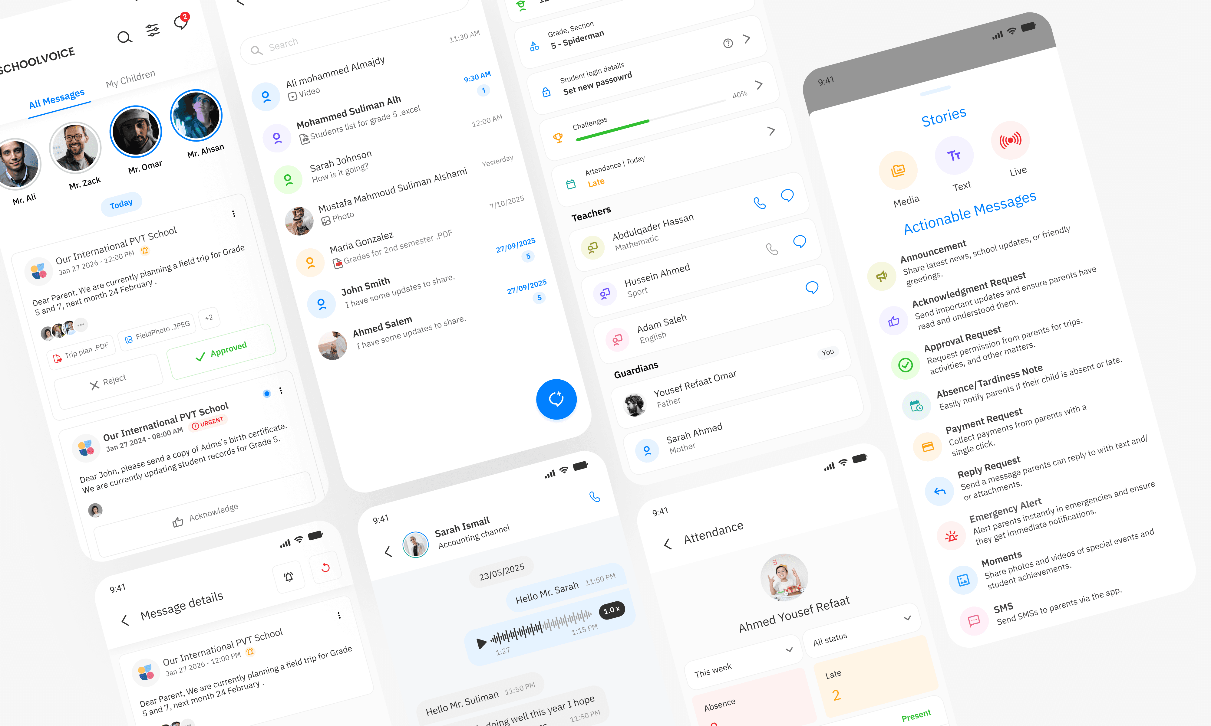
I built Schoolvoice's first unified design system from scratch, covering both web and mobile. The core decisions:
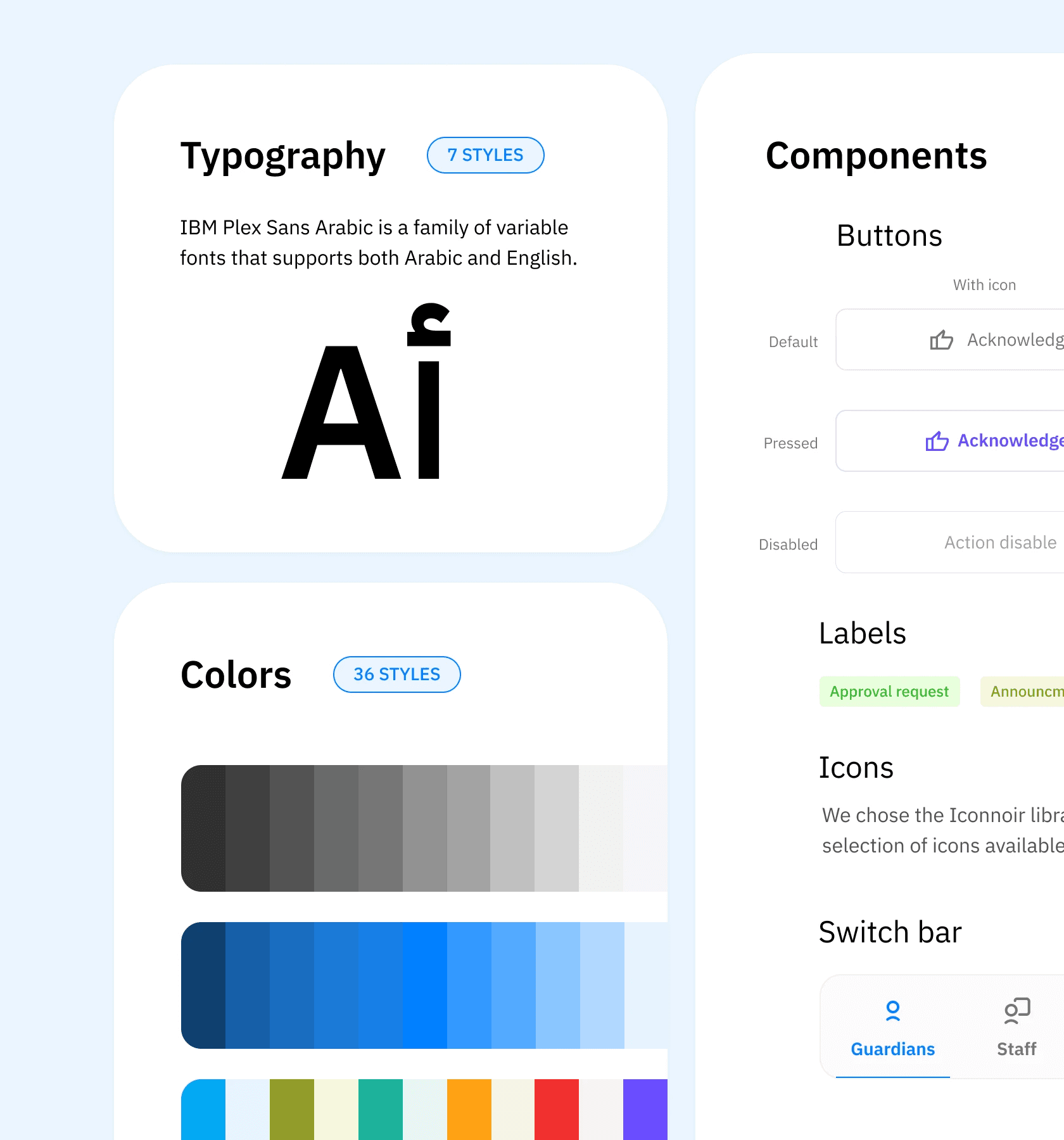
Typography: Replaced the split font setup with a single typeface family supporting Arabic and Latin scripts at equal visual weight, eliminating the size imbalance and making bilingual layouts behave predictably across both platforms.
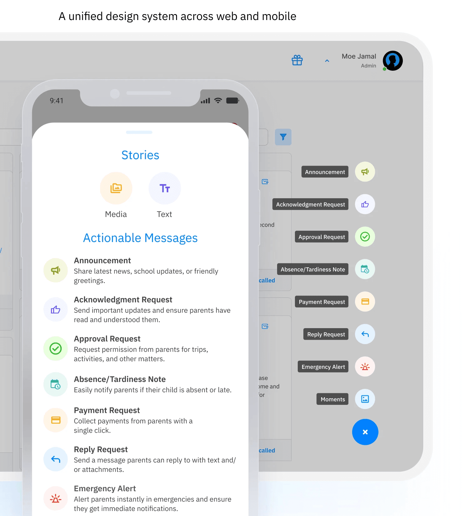
Iconography: Audited every icon set across the product and consolidated them into one consistent library, mapped to feature identity rather than platform.
Color system: Defined a token-based color architecture that accommodated Schoolvoice's white-label requirements, allowing brand colors to flex per client without breaking the underlying system. This directly reduced the product team's review time per screen, since design decisions were no longer open to interpretation.
Feature parity: Brought Sent, Draft, and Scheduled Messages to mobile — eliminating the forced platform switch and giving teachers a complete workflow on either device.
The Outcome:
"Less review time. Less friction. One product that finally feels like one."
The design system became the single source of truth for both design and engineering. New screens and white-label reviews that previously required back-and-forth across the product team could now be validated against a clear, documented standard — reducing review cycles and accelerating delivery.
The most measurable impact came from the token-based color architecture. Before the system, onboarding a new white-label client required a full week of manual review across every screen to ensure brand colors were applied correctly. After implementing the color system library, switching a client's primary color became a single variable change in the codebase — reducing what was once a week of review work to under two hours.
Teachers no longer needed to context-switch between platforms to complete their messaging workflow. The experience of drafting, scheduling, and tracking messages became device-agnostic for the first time.
For a product built on trust between schools and families, consistency isn't just a design value — it's a credibility signal.
What This Taught Me:
"A design system is a product decision, not a design deliverable"
The hardest part wasn't building the system — it was making the case for it. A design system has no immediate visible output. Its value shows up in the work it quietly prevents: the mismatched component, the off-brand white-label, the review meeting that didn't need to happen.
Building for white-label from day one forced a discipline that most design systems skip: designing for variability, not just consistency. Every token had to work for Schoolvoice's brand and for a school district with completely different brand colors — without breaking either.
That constraint made the system more resilient, not more complicated.
More Projects
UX/UI Design
Unifying the Product Experience
One product. Two platforms. Zero consistency — until now.
Year :
2024
Industry :
Education
Client :
SCHOOLVOICE
Role :
Lead UX/UI Designer
The Problem:
"A product that felt like two different apps"
Schoolvoice runs across web and mobile, but for teachers navigating between both, the experience was anything but seamless. The disconnect wasn't cosmetic. It was structural.
Arabic and English typography behaved differently across platforms: the Arabic typeface was oversized and visually heavy compared to its English counterpart, breaking reading rhythm and making bilingual interfaces feel unbalanced. Icons representing the same features carried different visual treatments depending on where you opened the app. Feature colors were inconsistent — the same action looked different on web versus mobile, eroding the mental model teachers built over time.
To make things more complex, key workflows — Sent Messages, Draft Messages, and Scheduled Messages — existed only on web. Teachers who started a task on mobile had no choice but to switch platforms mid-flow, creating friction at exactly the moments that required focus.
Without a shared visual language, every screen felt like a negotiation between two separate products.
Design Decisions:
"Building a design system from the ground up for two platforms and multiple brands"
The solution wasn't a visual refresh. It was an infrastructure problem that needed a systematic answer.
I built Schoolvoice's first unified design system from scratch, covering both web and mobile. The core decisions:
Typography: Replaced the split font setup with a single typeface family supporting Arabic and Latin scripts at equal visual weight, eliminating the size imbalance and making bilingual layouts behave predictably across both platforms.
Iconography: Audited every icon set across the product and consolidated them into one consistent library, mapped to feature identity rather than platform.
Color system: Defined a token-based color architecture that accommodated Schoolvoice's white-label requirements, allowing brand colors to flex per client without breaking the underlying system. This directly reduced the product team's review time per screen, since design decisions were no longer open to interpretation.
Feature parity: Brought Sent, Draft, and Scheduled Messages to mobile — eliminating the forced platform switch and giving teachers a complete workflow on either device.
The Outcome:
"Less review time. Less friction. One product that finally feels like one."
The design system became the single source of truth for both design and engineering. New screens and white-label reviews that previously required back-and-forth across the product team could now be validated against a clear, documented standard — reducing review cycles and accelerating delivery.
The most measurable impact came from the token-based color architecture. Before the system, onboarding a new white-label client required a full week of manual review across every screen to ensure brand colors were applied correctly. After implementing the color system library, switching a client's primary color became a single variable change in the codebase — reducing what was once a week of review work to under two hours.
Teachers no longer needed to context-switch between platforms to complete their messaging workflow. The experience of drafting, scheduling, and tracking messages became device-agnostic for the first time.
For a product built on trust between schools and families, consistency isn't just a design value — it's a credibility signal.
What This Taught Me:
"A design system is a product decision, not a design deliverable"
The hardest part wasn't building the system — it was making the case for it. A design system has no immediate visible output. Its value shows up in the work it quietly prevents: the mismatched component, the off-brand white-label, the review meeting that didn't need to happen.
Building for white-label from day one forced a discipline that most design systems skip: designing for variability, not just consistency. Every token had to work for Schoolvoice's brand and for a school district with completely different brand colors — without breaking either.
That constraint made the system more resilient, not more complicated.
More Projects
UX/UI Design
Unifying the Product Experience
One product. Two platforms. Zero consistency — until now.
Year :
2024
Industry :
Education
Client :
SCHOOLVOICE
Role :
Lead UX/UI Designer
The Problem:
"A product that felt like two different apps"
Schoolvoice runs across web and mobile, but for teachers navigating between both, the experience was anything but seamless. The disconnect wasn't cosmetic. It was structural.
Arabic and English typography behaved differently across platforms: the Arabic typeface was oversized and visually heavy compared to its English counterpart, breaking reading rhythm and making bilingual interfaces feel unbalanced. Icons representing the same features carried different visual treatments depending on where you opened the app. Feature colors were inconsistent — the same action looked different on web versus mobile, eroding the mental model teachers built over time.
To make things more complex, key workflows — Sent Messages, Draft Messages, and Scheduled Messages — existed only on web. Teachers who started a task on mobile had no choice but to switch platforms mid-flow, creating friction at exactly the moments that required focus.
Without a shared visual language, every screen felt like a negotiation between two separate products.
Design Decisions:
"Building a design system from the ground up for two platforms and multiple brands"
The solution wasn't a visual refresh. It was an infrastructure problem that needed a systematic answer.
I built Schoolvoice's first unified design system from scratch, covering both web and mobile. The core decisions:
Typography: Replaced the split font setup with a single typeface family supporting Arabic and Latin scripts at equal visual weight, eliminating the size imbalance and making bilingual layouts behave predictably across both platforms.
Iconography: Audited every icon set across the product and consolidated them into one consistent library, mapped to feature identity rather than platform.
Color system: Defined a token-based color architecture that accommodated Schoolvoice's white-label requirements, allowing brand colors to flex per client without breaking the underlying system. This directly reduced the product team's review time per screen, since design decisions were no longer open to interpretation.
Feature parity: Brought Sent, Draft, and Scheduled Messages to mobile — eliminating the forced platform switch and giving teachers a complete workflow on either device.
The Outcome:
"Less review time. Less friction. One product that finally feels like one."
The design system became the single source of truth for both design and engineering. New screens and white-label reviews that previously required back-and-forth across the product team could now be validated against a clear, documented standard — reducing review cycles and accelerating delivery.
The most measurable impact came from the token-based color architecture. Before the system, onboarding a new white-label client required a full week of manual review across every screen to ensure brand colors were applied correctly. After implementing the color system library, switching a client's primary color became a single variable change in the codebase — reducing what was once a week of review work to under two hours.
Teachers no longer needed to context-switch between platforms to complete their messaging workflow. The experience of drafting, scheduling, and tracking messages became device-agnostic for the first time.
For a product built on trust between schools and families, consistency isn't just a design value — it's a credibility signal.
What This Taught Me:
"A design system is a product decision, not a design deliverable"
The hardest part wasn't building the system — it was making the case for it. A design system has no immediate visible output. Its value shows up in the work it quietly prevents: the mismatched component, the off-brand white-label, the review meeting that didn't need to happen.
Building for white-label from day one forced a discipline that most design systems skip: designing for variability, not just consistency. Every token had to work for Schoolvoice's brand and for a school district with completely different brand colors — without breaking either.
That constraint made the system more resilient, not more complicated.